I'm having problem with my laptop last night and I have no other choice but to clean it up and reformatting the hard drive. Doing this technically consumes patience. Since I started late at night, I finished by 3 o'clock in the morning. And to avoid getting stress, I took my drawing pad and pencil and do the doodle. What is a doodle? A doodle is an unfocused drawing made while a person's attention is otherwise occupied. Doodles are simple drawings that can have concrete representational meaning or may just be abstract shapes. …
The Sketchbook that I Kept
I haven't kept any sketchbook before when I was in my elementary years. I used to draw anything I can think of at the back pages my notebooks. And it made my mother angry at me every time she saw it, when she checked my school bag at home. But that's who I am. You can't stop me doing it, most often when I am bored or even when I am excited, or even when I am with somebody on the phone. Only one thing can stop me – "Hey! Where's my pencil?" When I was in high school, I spend much of my money buying art materials and yes! o…
10 Amazing Photoshop Tutorials | My Choice
These are my collections of the most interesting and amazing Photoshop tutorials. In this collection, be inspire with these 10 various tutorials as your references upon doing your own artworks. Enjoy! Creating an Abstract Watercolor Wallpaper by: 10 Steps How to Create a Realistic IES Lighting Effect in Photoshop by: PSD Tuts+ How to Create Stunning and Bold 3D Text by Six Revisions Create a Shiny Earth with Photoshop 3D Layers by Psdtuts+ How to Create a Vintage Radio Poster in Photoshop by Adobetutorialz…
My Top 10 Art Blogs
Here's my top 10 Art Blogs that may also suit to your list. 1st Drawn! The Illustration and Cartooning Blog Drawn is a collaborative weblog for illustrators, artists, animators, cartoonists, and anyone who likes to draw. 2nd Art Fag City Art Fag City is New York-based art blog dedicated to providing exposure to emerging contemporary art and under-known artists. We believe that engaging in smart, critical debate helps us better define and shape the world we want, and that creative production of all forms is essential. 3…
Lesson # 1: Here's a simple instructions on how to mix all-purpose glue (if no photo emulsion available) and sensitizer (Potassium Dichromate) for Photographic T-shirt Printing. Materials: all-purpose glue, Sensitizer, plastic spoon and empty container with lid. The mixture should be 5:1, that is, 5 parts of glue and 1 part of Sensitizer. It is a ratio, for example you're going to mix 5 cups of glue and 1 cup of Sensitizer in a container. You can buy Sensitizer ( Potassium dichromate ) in any Tulco or other T-shir…
Stretch Me This Way | Silkscreen Tutorial
Lesson #2: Make your own silkscreen frame by simply following these steps below. The instructions are the same as any How to Make Silk Screen Frame Tutorials , I simply add a little bit of idea I've learned that I guess may help you out on how to stretch the organza much more easier than the usual pulling.^^ We need 2-inch x 2-inch wood, saw, hammer, nails or screws, gun tacker, organza/synthetic screen mesh, scissors, masking tape and hand sprayer for this project. Instructions: 1. Cut two 30-cm lengths of 5-cm by 5-c…
Lesson # 3 Tomorrow will be Holy Week Day Four – Silent Wednesday . It was Scholars speculations that Jesus and his disciples spent this day resting in Bethany in expectation of the Passover. Bethany is the place where Jesus Christ raises Lazarus from the dead. Remembering Holy Week & my work It reminds me of the time when I was still in the Philippines and managing my Art and Sign shop when Holy Week comes. I marked it as one of the busiest months in the Philippine calendar. Since more than 85 percent of the Philippine population is …
Featured Post
 Free templates
Free Tarpaulin Template for Your Family Reunion!
25.4.12
7 Steps Doodling Lion’s Face Out from a Rectangle
19.4.12
The Sketchbook that I Kept
Only one thing can stop me – "Hey! Where's my pencil?"
When I was in high school, I spend much of my money buying art materials and yes! of course – sketchbook. I can't recall how many sketchbook I've used and wasted. Some of it were forgotten and misplaced, sometimes stolen or borrowed and never returned.
I envy others which still now been keeping their sketchbooks.
I have a friend before who still had her sketchbook since preschool and another one when she had taken a fashion designers course, she used it as her illustration for fashion references. Sometimes, I got to thinking, if I keep my sketchbooks before maybe I have a dozen of it now and a lot of sketches I might shared with you.
And so I decided to get a sketchbook and a sketchpad now and promise to keep it for life. lol!
Here are few sketches I've done on my new mini-sketchpad.
Terms:
SKETCH
And it is often applied to graphic works done by dry media such as graphite pencil, charcoal or pastel. It may also refers to drawings done in pen and ink, ballpoint pen, water color and oil paint. A sculptor might model 3D sketches in clay or plasticine.
SKETCHBOOK
is "a book or pad with blank pages for sketching," and is frequently used by artists for drawing or painting as a part of their creative process.
18.4.12
10 Amazing Photoshop Tutorials | My Choice
9.4.12
My Top 10 Art Blogs
Here's my top 10 Art Blogs that may also suit to your list.
1st Drawn! The Illustration and Cartooning Blog
2nd Art Fag City
Art Fag City is New York-based art blog dedicated to providing exposure to emerging contemporary art and under-known artists. We believe that engaging in smart, critical debate helps us better define and shape the world we want, and that creative production of all forms is essential.3rd Doodlers Anonymous
4th Wooster Collective
5th FFFFOUND! / EVERYONE
6th Illustration Friday
7th Buy, Sell, and Research Fine and Decorative Art online
8th BOOOOOOOM!
9th Motion Served Featured Projects
10th Art Threat
7.4.12
Using All-Purpose Glue Instead of Photo-emulsion for Photographic T-shirt Printing
 Lesson # 1:
Here's a simple instructions on how to mix all-purpose glue (if no photo emulsion available) and sensitizer (Potassium Dichromate) for Photographic T-shirt Printing.
Since our topic is "when no emulsions are available", then let's stick our topic with our All-Purpose Glue, which I know have the same result anyway.
 |
| Materials: glue, sensitizer, plastic spoon and empty container with lid. |
 |
| Mixed glue and sensitizer granules in a container. |
 |
| The correct mixture should have an egg yolk color. |
 |
| After mixing, keep the container close and put it in a cool place away from children. |
Read Lesson #2: How to Prepare your Silk Screen Frames.
4.4.12
Stretch Me This Way | Silkscreen Tutorial
Make your own silkscreen frame by simply following these steps below.
5. Wipe it with dry cloth or put it under the sun to dry. Remove the excess fabric with scissors. Then sealed each sides with masking tape.
READ Lesson #3: Lay-outing and Color Separation
3.4.12
CMYK Pattern for T-shirt Printing Using Photoshop

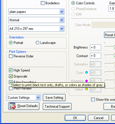
Lesson # 3
Tomorrow will be Holy Week Day Four – Silent Wednesday. It was Scholars speculations that Jesus and his disciples spent this day resting in Bethany in expectation of the Passover. Bethany is the place where Jesus Christ raises Lazarus from the dead.
And I hate deadlines. So, additional manpower was needed and spending extra time to finish everything before Wednesday ends. Because everyone need to spend a day for resting and commemorating the sacrifices Jesus Christ had given us to be saved.
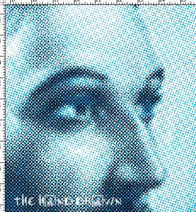 |
| Color Halftone | Cyan + Black |
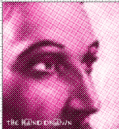 | |
|
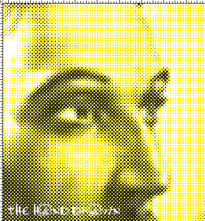 | |
|
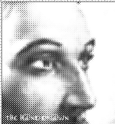 |
| Color Halftone | Black |
 | |
|
"Do not be anxious about anything, but in everything by prayer and supplication with thanksgiving let your requests be made known to God. And the peace of God, which surpasses all understanding, will guard your hearts and your minds in Christ Jesus."
Link List
My Other Blogs
Followers
Search This Blog
Blog Archive
-
▼
2012
(31)
-
▼
April
(8)
- 7 Steps Doodling Lion’s Face Out from a Rectangle
- The Sketchbook that I Kept
- 10 Amazing Photoshop Tutorials | My Choice
- My Top 10 Art Blogs
- Using All-Purpose Glue Instead of Photo-emulsion f...
- Stretch Me This Way | Silkscreen Tutorial
- CMYK Pattern for T-shirt Printing Using Photoshop
- Black and White – Why Panda only had?
-
▼
April
(8)
Categories
- Admin's Thoughts 11
- animation 1
- art blog 3
- Baby Shark 1
- Birthday 5
- Buzz Lightyear 1
- Charcoal Portraits 1
- children display 1
- color 1
- color basic 3
- Color Separation 4
- Design 11
- digital textile printing 4
- display 1
- doodle 2
- doodling 2
- drawing 6
- featured art 8
- featured artist 4
- frame 1
- Free templates 18
- Freebies 12
- google doodle 1
- google panda 1
- grid lines 1
- Hari Raya Aidil Fitri 2
- Hari Raya Aidilfitri 2012 1
- Holy Week 1
- how to 12
- Hua Ho Department Store 1
- Invitation 2
- Istana Nurul Iman 1
- links and them 1
- Mother's Day Special 1
- Open House 1
- painting 1
- Palace Open House 2012 1
- panda 1
- Photoshop 13
- photoshop cs5 1
- sensitizer and glue 4
- Silent Wednesday 1
- Silk screen printing 6
- sketch 1
- sketching 4
- sketching lesson 2
- styrofoam carving 1
- Sultan of Brunei 1
- T-shirt printing 8
- Tarpaulin 12
- toys 1
- tutorials 19
Tags
Popular Posts

Stretch Me This Way | Silkscreen Tutorial

Free Editable Birthday Tarpaulin Template in PSD format

Free Editable Templates for Tarpaulin in Ai CS5 format

CMYK Pattern for T-shirt Printing Using Photoshop

7 Steps Doodling Lion’s Face Out from a Rectangle

Stretch Me This Way | Silkscreen Tutorial

Free Editable Birthday Tarpaulin Template in PSD format


